Welcome to My Fashion Blog
Visual Merchandising Analysis
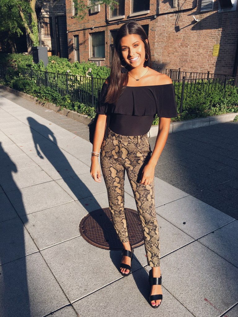
“Building My Brand Identity”
Academic Background
I am currently a sophomore at Illinois State University and I am studying Fashion Merchandising with a minor is Business Administration. I have enjoyed the classes I have taken thus far and they have made me fall more in love with fashion and I am so excited to dive deeper into my discipline.
Experience and Achievements
I have worked in retail for five years now and I have gained a lot of experience with visual merchandising from helping set floor plans and window displays. Throughout working in retail I have learned a lot about my strengths and weaknesses in the workplace. I am very self-sufficient and task oriented. I learned a lot about customer service and working as a team as well.
This school year (2019-2020) I joined Zeta Tau Alpha which has provided me multiple opportunities for volunteering and leadership opportunities. I am the Apparel Chair for my chapter and it has been a lot of fun as well as great experience creating ideas and seeing them come to life.
Career Goals
My goal for after graduation is to find a job with a big corporation in Chicago as a buyer. The role of a buyer has always fascinated me and I think it is a very important job. As technology and media become more prevalent in our society we are noticing trends towards online shopping which is causing stores to close down. I am hoping that this will open more doors for online stores to use augmented reality and make shoppers experience that much better online. I would be interested in becoming a buyer for online boutiques and/or large retailers.
Purpose
I am creating this blog to analyze various fashion window displays, I will be critiquing them using my knowledge from my Fashion Promotion course. I am excited to be able to use this information in the future when creating my own window displays.
Visual Merchandising Analysis #1
Window Display #1 Bad Representation
This window display doesn’t make me want to go into the store. I feel as if there is no element of surprise or something that catches my eye. The black and white images are dull and cover the garments. I think there is unity because they are all black and white pictures but it isn’t “artful”. There isn’t a sense of visual movement so the eye doesn’t know where to look, they could incorporate direction to draw my eye throughout the window display. If the visual merchandiser added more contrast in color choice and tension within the design then I think this could be a good display.
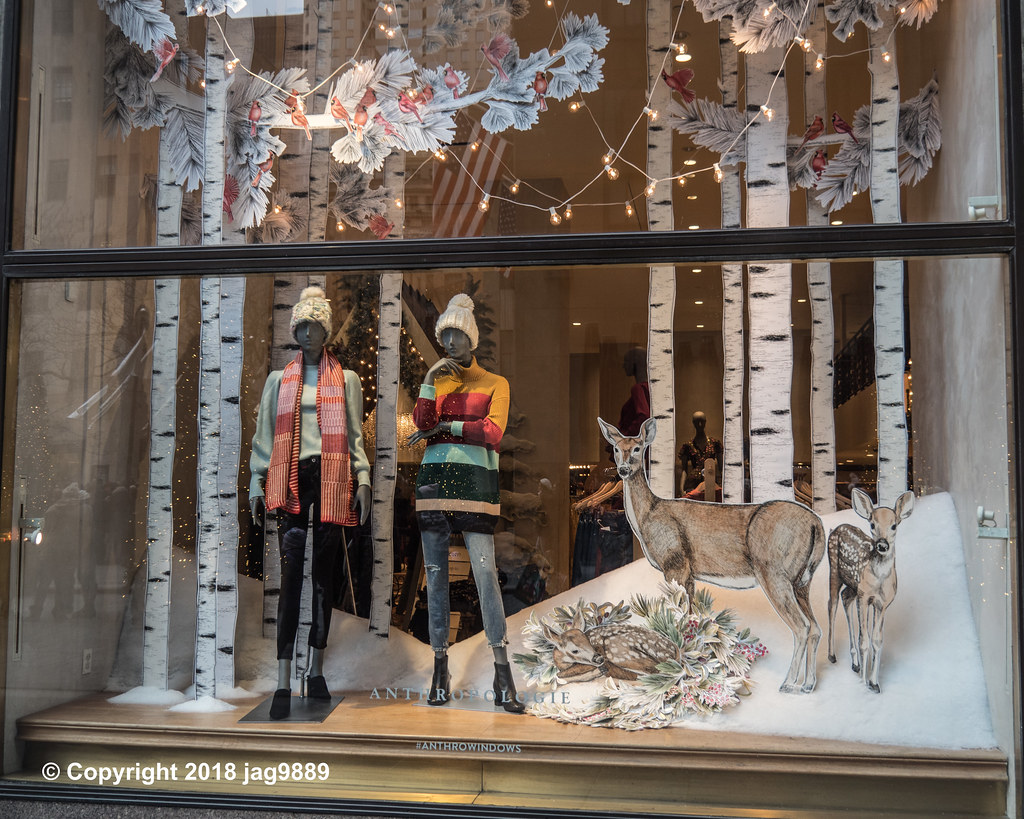
Window Display #2 Good Representation
This window display is a great representation of visual merchandising, because it has all of the key concepts. Line is the first element that stands out to me because of the tall white trees, my eye was really drawn to the trees and the pop of red from the birds. The proportion of this display is very realistic in terms of the height of the trees compared to the mannequins as well as the size of the deer compared to the mannequins. There is also a great sense of sequence, as my eye follows the display there is a gradation from large to small props. This display is harmonious in the sense that it creates a winter scene and it flows together well. Repetition is created throughout the display with the branches and leaves hanging down from the trees as well as the lighting. I think this is the perfect display for the winter time and it would definitely draw me into the store.
Visual Merchandising Analysis #2
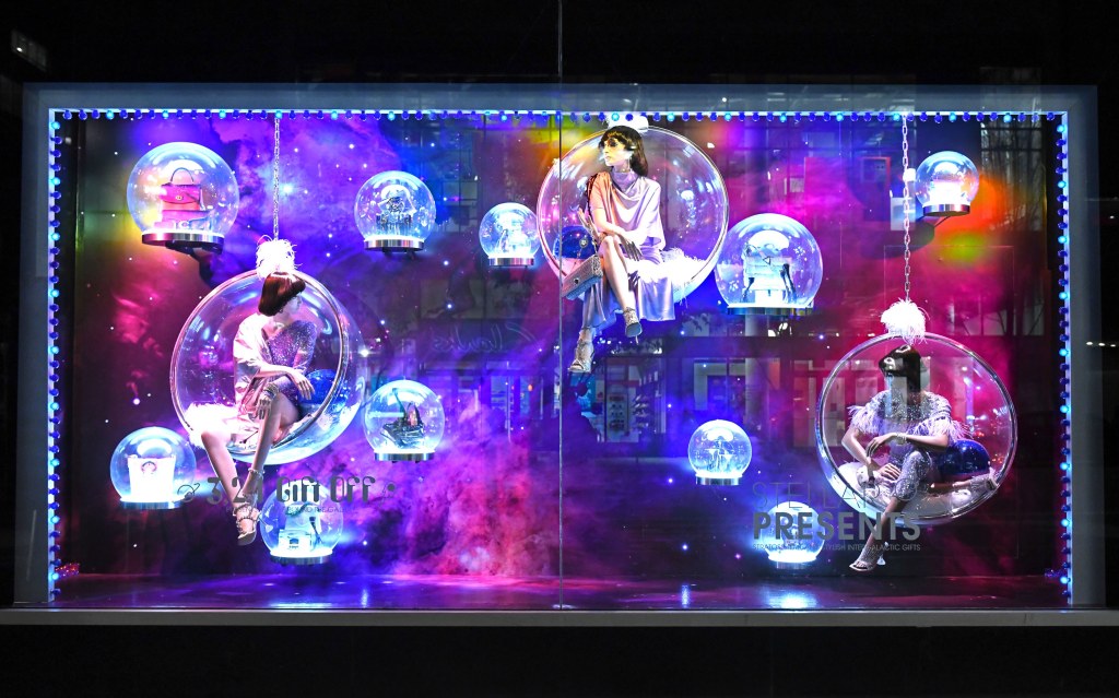
Window Display #3 Good Representation
This is an amazing example of a good window display. This window would immediately draw my eye and I would spend a lot of time looking at it which would cause me to want to go inside the store and shop. The “bubbles” that the mannequins are sitting in create a great focal point and element of suprise. It is very proportional because of the way the bubbles are positioned. The window overall is harmonious and the color scheme is complementing. The bubbles give a sense of a light optical weight. There is a curved direction that is easy for the eye to follow and it doesn’t cause my eye to focus on one thing, rather the whole window.
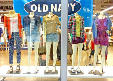
Window Display #4 Bad Representation
I chose this window display because if I was walking through a mall this window would not catch my eye and I wouldn’t want to go in and shop. Although mannequins can be a very useful tool when it comes to visual merchandising I feel as if they shouldn’t be the only thing featured in a window display. There isn’t line or direction that guides my eye throughout the window. If I were to suggest a change in their window I would suggest that they add a fun background and other props to draw your eye to. The Visual merchandiser did well with unity and repetition because it is all similar and gives a “runway” feel.
Visual Merchandising Analysis #3
Window Display #5 Good Representation

This visual merchandising set up is very appealing to the eye and is a great representation of a store should present their merchandise. The products are separated by end use and are paired with other items that would compliment each other. Throughout the display there is unity and harmony because all the garments fit well together and are complimenting. The use of formal balance creates a focal point and its easy for the eye to follow. They used tables and mannequins appropriately throughout the display.
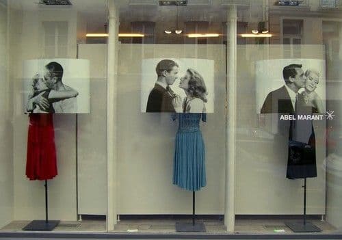
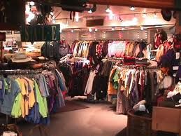
Window Display #6 Bad Representation

Forever 21 is often a store that I rather shop online. Their store has an free flow floor plan which causes clutter and chaos. In this display merchandise isn’t separated by end use and it isn’t displayed in a way that I can find coordinating items. The visual merchandiser did use formal balance but the racks are overcrowded so it will be hard for the customer to shop.
Visual Merchandising Analysis #4
Window Display #7 Good Representation
This is a great representation of visual merchandising due to the unity and harmony of the display because it has a coordinating color scheme and the display uses informal balance which also creates unity. Just by looking at this display I can get a great sense of the brand identity this certain store possesses. I think the use of cross bars and face-outs was very effective because it is easy to shop and items are separated by end use.
Window Display #8 Bad Representation
Unfortunately this is the reality of some retail stores and personally as a consumer it overwhelms me. There is no unity within the display and items are just placed randomly as well as there is no line or direction so I am not sure where to look first which makes the store hard to shop. Usually stores like this turn me away because I don’t want to take the time to search through all of the round racks, I think that the round racks should be used in the back of the store to reduce clutter when customers walk in. They used signs conveying “Departments” such as sale which is helpful for some navigation.
Visual Merchandising Analysis #5
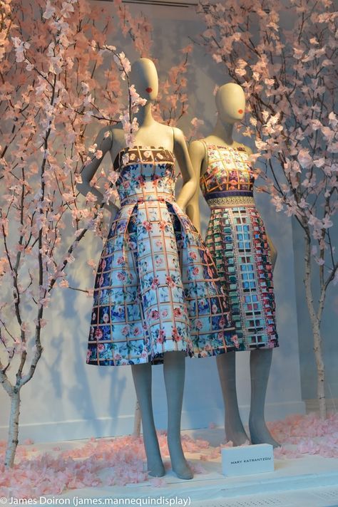
Window Display #9 Good Representation
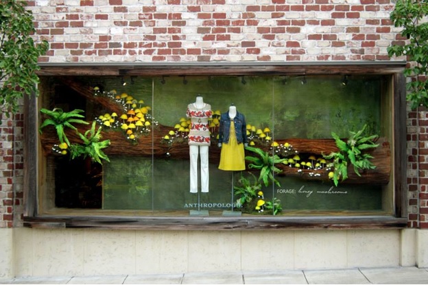
I love this window display because I feel as if it goes hand in hand with Anthropologies brand identity. The use of the horizontal tree creates line which moves my eye across the display and to the focal point of the two mannequins. The lime dress on the mannequin suits the theme well and creates unity. This display also demonstrates formal balance and visual rhythm which is very appealingI think this display is fun and eye catching!
Window Display #10 Bad Representation
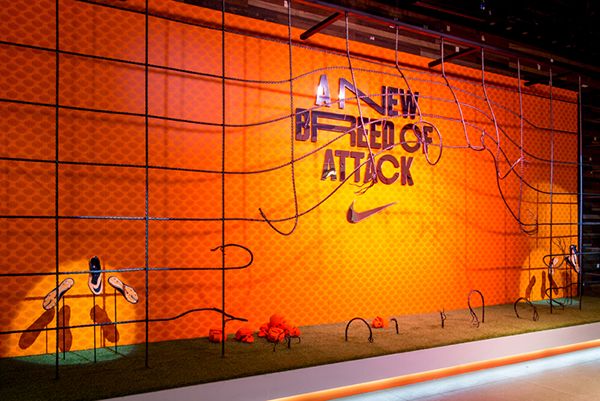
Unfortunately this display would not make me want to go into a Nike store, I feel as if this display lacks unity because I am unsure what the theme is or what they are trying to portray. The display could use mannequins to display clothing items or other fixtures to display the shoes better. We all know Nikes slogan is “Just Do it ” and their brand is mostly catered to athletes so they could incorporate that into their display designs. It is somewhat appealing due to the bright colors and balance of the display.
Visual Merchandising Analysis #6
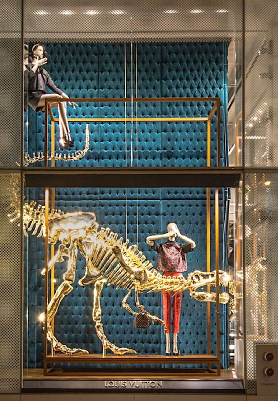
Window Display #11 Good Representation
I love this display because it offers an element of surprise because you would not normally see this in a retail store window. This display would definitely make me stop and take a look, the overall display has a sense of unity due to the color scheme and the pops of red are very effective. I am unsure of this store and what their brand identity is from looking at this display but you can tell that it is probably a high end store. The lighting used hits the mannequin perfect and creates shadows in all of the right places.
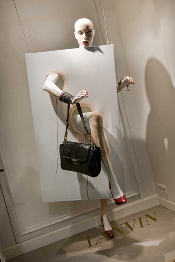
Window Display #12 Bad Representation
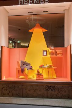
We all know Hermes and I feel as if this display doesn’t portray their brand identity and personally this display would not bring me into the store if I wasn’t familiar with the brand already. I am unsure of the theme and how it relates to their brand identity although it is eye catching it would confuse me what the store was trying to advertise. There is no rhythm to this display as well as no line or direction so I am unsure where to focus or what the main objective was with this display.
Visual Merchandising Analysis #7
Window Display #13 Good Representation
This display is beautiful and is very harmonious because the theme is present in every aspect of this display. This display is very simple yet elegant and it would catch my eye. The use of the tall trees create direction and they make me scan the display up and down as well as looking at the mannequins. The display uses formal balance which is very appealing and it creates a sense of unity throughout the display. This would be a great display for the spring time because of the use of flowers.
Window Display #14 Bad Representation
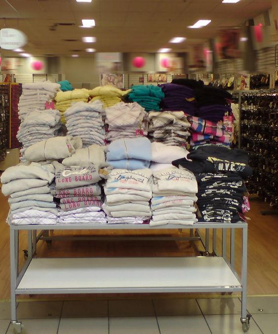
This is likely what a lot of department stores look like and it is reality but this display makes it hard for consumers to shop. This kind of set up discourages not only consumers but retail workers because it is hard to find what they are looking for. The visual merchandiser could have used a 4-way to bar to organize or a rounder to make it easier for consumers to shop. I think the use of a mannequin would have been helpful as well. This display doesn’t really use any design elements.
Visual Merchandising Analysis #8
Window Display #15 Good Representation
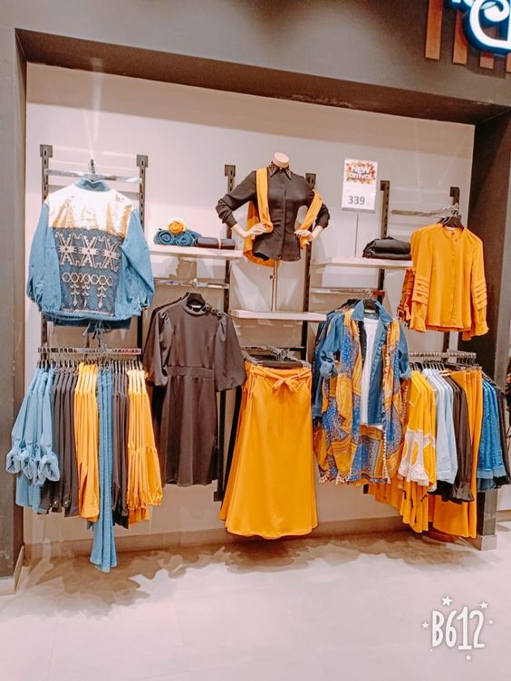
This display is very appealing to me, I can pick up on the brand identity right away. This display is also very appealing because of the color scheme which creates unity throughout the display. The use of formal balance is very effective as well as the use of multiple pictures and a mannequin. The is visual rhythm throughout the display and all of the garments “hang well together” and items are serrated by end use. This is an easy display for consumers to shop and find everything they need. Overall this display is pleasing to the eye and pleasing to the consumer who may be shopping at this store.
Window Display #16 Bad Representation
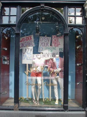
This window display is ineffective because my eye goes right to the posters and I don’t even notice the mannequins or what they are trying to sell. I feel as if this display lacks design principles so it is not effective. There needs to be a sense of unity or rhythm throughout this display and then the use of the posters and mannequins could be effective. Personally this window display would not stop me and I would not go into their store.
Visual Merchandising Analysis #9
Window Display #17 Good Representation

This display is so fun and would make me want to go into their store, especially since I can understand their brand identity. I appreciate how the items are hung instead of using a mannequin, it is a fun twist that you do not see very often. The lighting in this display is great and highlights the products efficiently. The display has a color scheme which creates unity and visual rhythm by creating consistency throughout the display. I would for sure stop to look at this display and it would draw me into the store.
Window Display #18 Bad Representation
Follow My Blog
Get new content delivered directly to your inbox.
